Appearance
The Appearance tab controls how the document looks: colors, fonts, page orientation, table style and totals. All changes are visible instantly in the preview on the right.
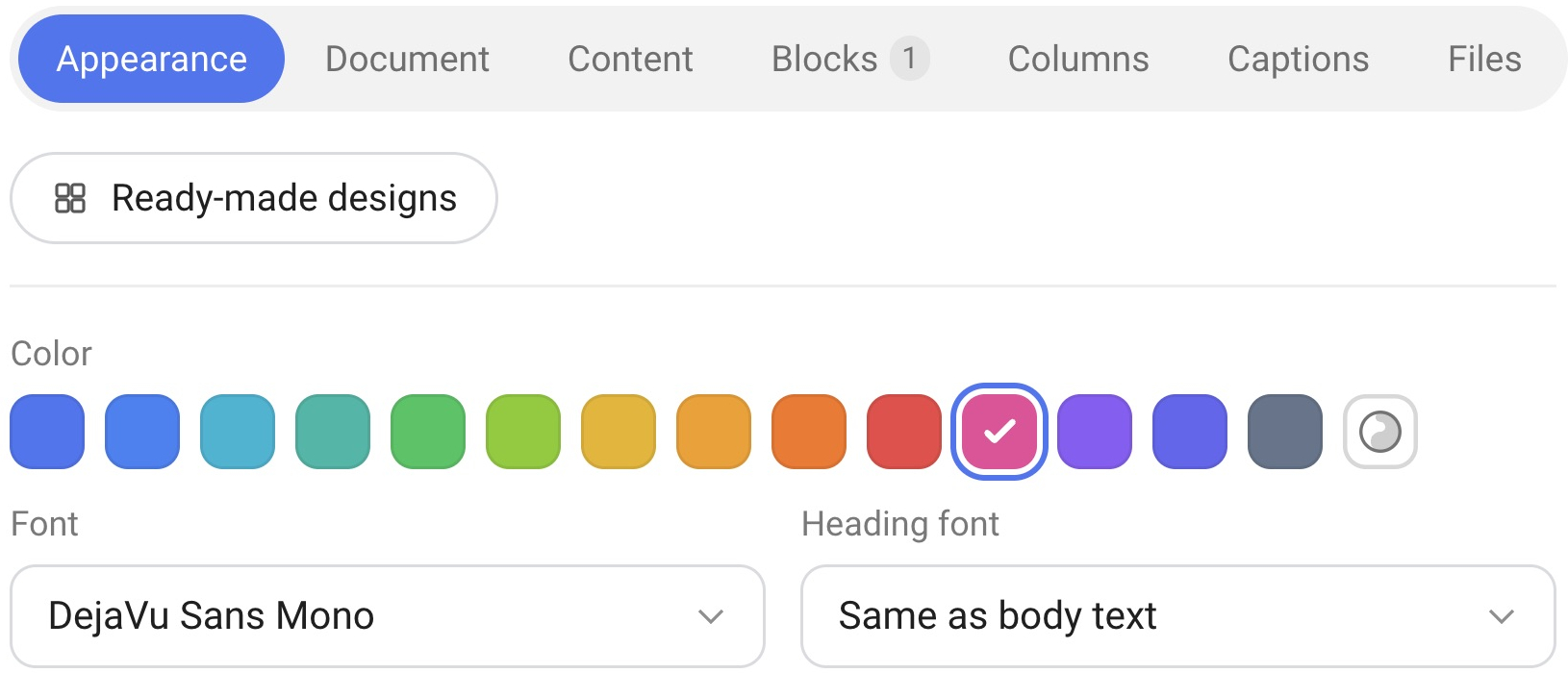
Ready-made designs
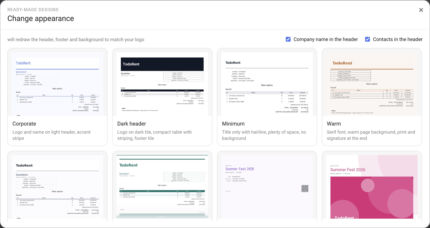
The “Ready-made designs” button opens a gallery of ready-made solutions — the “Change appearance” window. Each card has a thumbnail and a short description: “Corporate”, “Dark header”, “Minimum”, “Warm”, “European”, “Landscape”, “With title page”, “Photo title page”, “Monochrome”, “Draft”, “Elegant” and “With stamp”. At the top of the window are two checkboxes — “Company name in the header” and “Contacts in the header”: they define which company data goes into the header and footer. The hint at the button says that a ready-made design will redraw the header, footer and background to match your logo.
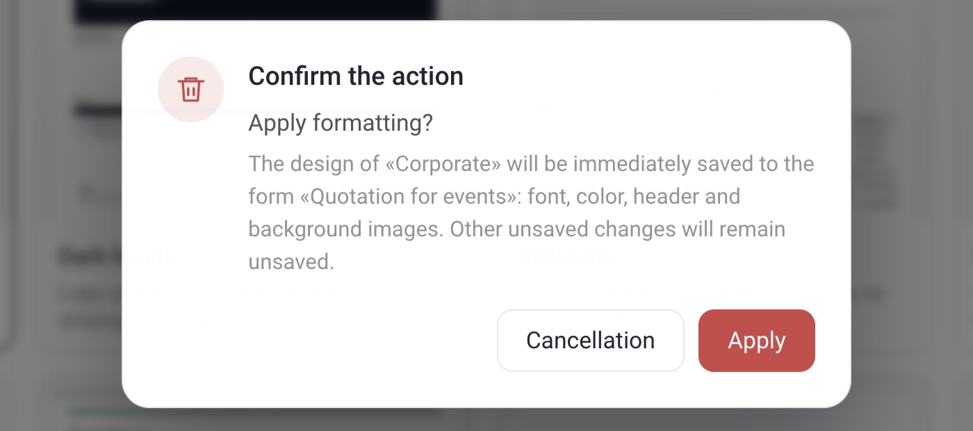
Please note. A ready-made design is written to the form immediately, without clicking “Save”. Before applying it, the program asks you to confirm the action and reminds you that the font, the color and the header and background images will be replaced. So if you uploaded your own header, footer or background pictures on the Files tab, they will be replaced by the pictures of the chosen design. Other settings of the tab can change too — for example, the font and the header layout. To keep the current look, first make a copy of the form (the “Duplicate” icon on the card in the gallery) and try the designs on the copy.
Color and fonts
Color is the accent color of the document: the heading, the lines and the table fill. You choose it from the palette. The same color is shown as a dot on the form card in the gallery.
Font is the main font of the document, for example “DejaVu Sans Condensed”. The list contains sans-serif, serif and monospaced fonts, with a short hint next to each name. Ready-made designs can set other fonts too, for example “DejaVu Serif”.
Heading font is “Same as body text” by default. You can choose a separate font for headings from the same list.
Text color is one of the palette colors (“Black, as before” is the first one) or any other color: use the “Own” button.
Orientation
The page can be “Portrait” or “Landscape”. Landscape is handy for long tables. The header, footer and background pictures are uploaded separately for each orientation on the Files tab. If no picture is uploaded for the landscape orientation, the portrait picture is printed.
Table
Grid — borders on all cells, as before;
Lines — horizontal lines only;
Dense — smaller font, colored table header;
Airy — no borders, wide rows.
Density
Regular — as it was;
Compact — smaller text, more lines per page;
Large — larger text and spacing;
Spacious — regular text with double spacing between lines and blocks.
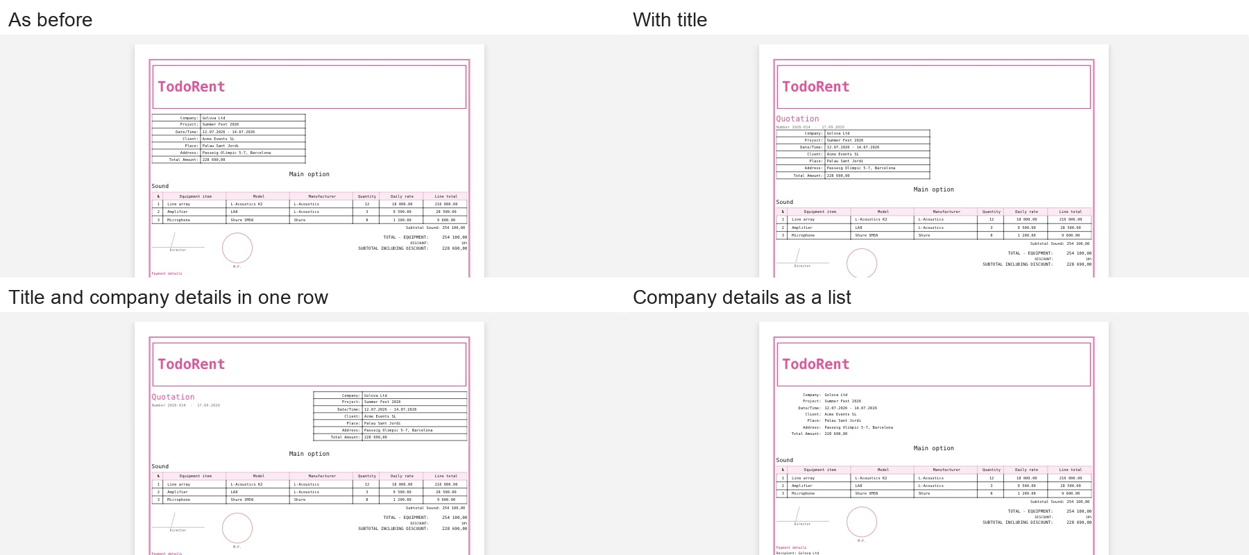
Layout of the header
As before — company details on the left, no title;
With title — document title and a line on top;
Title and company details in one row — name on the left, details on the right;
Company details as a list — no borders around the company details block.
Totals
Lines on the right — as it was;
As a banner — a background and a frame under the table.
Watermark
A watermark is a text across the page. “No” leaves the document clean. “draft” and “sample” print a pale inscription diagonally — handy when the document has not been approved yet.
Zebra
The “Zebra” switch turns on alternating fill of the table rows.